
In every industry, standards are used to help ensure that everyone can be on the same page, simplifying communications and efficiencies in working together. Here’s how that same principle applies to reports.
Below are two different income statement reports. Take a moment to examine each one. Which is easier to read?
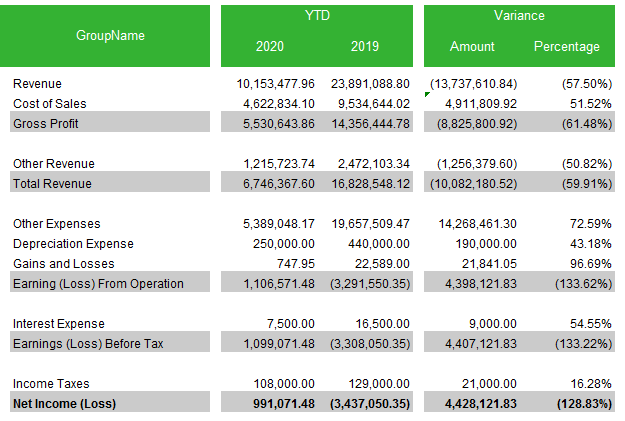
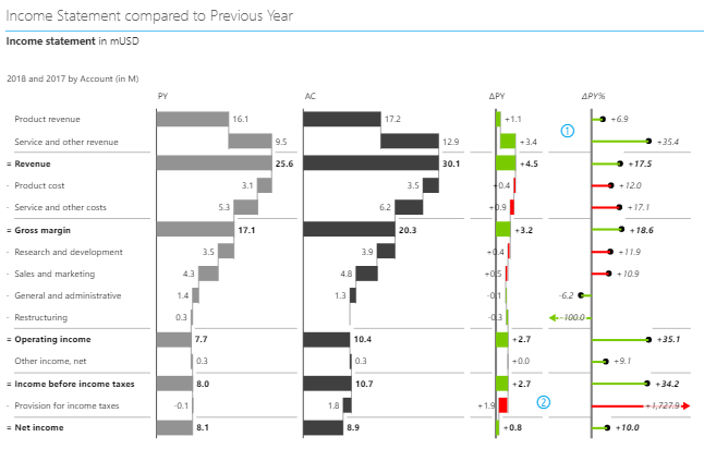
The one on the left utilizes a traditional style and is focused on the numbers. The one on the right is based around patterns and pattern recognition, similar to how sheet music is based on patterns.
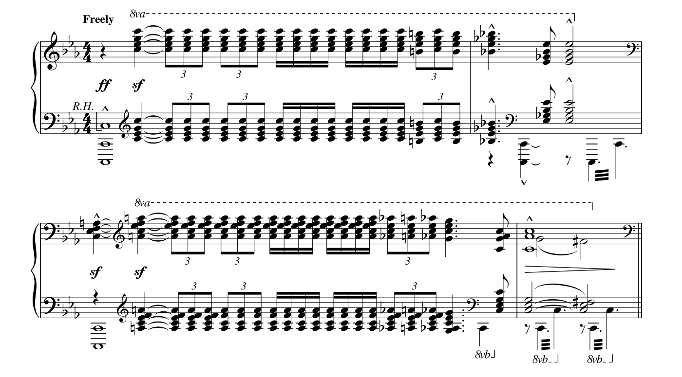
How music relates to financial reports
The highlighted section below is played in about 20 seconds and the only way the 400 notes can be played in that time is if the pianist recognizes the chord patterns:
Why we use Standards
What would happen if each composer user different ways to write their music? Musicians would need to learn and remember the specifics of each composer’s way of writing music. This means that delivering the message from the composer to the musician is inefficient and prone to error.
 Where else can you see standards in use?
Can you image the chaos if road signs didn’t follow standards? How much easier are these to read when the shape tells half the message?
The power of patterns
By leveraging patterns and the power of the human brain’s ability to recognize and interpret patterns you can create reports with much greater information density. These reports have higher information density yet are easier to understand.
The patterns in the report on the top right are:
- Prior year is grey or outlined
- Actual or current year is black
- A Positive variance is green
- A Negative variance is red
The coloured variance highlights the message(s) the report is designed to present. This facilities comprehension and reduces the time needed to understand the message being presented.
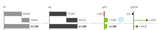
Another pattern is that the second row builds on the first to create the total below. This also provides a visual of the relative contribution. The change columns also provide a visual cue for the relative changes.
This example is based on the International Business Communication Standards (IBCS®) which are practical proposals for the design of reports, presentations, dashboards and the diagrams and tables contained therein.